
Overview
Overview
Unifying visual artifacts for improved workflows
I spearheaded efforts to revamp our nascent design system, enhancing color contrast, updating outdated components, and implementing variables for a seamless dark-to-light theme workflow.
I spearheaded efforts to revamp our nascent design system, enhancing color contrast, updating outdated components, and implementing variables for a seamless dark-to-light theme workflow.
Problem
Problem
With Messari’s expanding offerings, design and development needed a way to create and replicate work quickly at scale.
With Messari’s expanding offerings, design and development needed a way to create and replicate work quickly at scale.
Outcome
Outcome
🚀
Increased developer and design efficiency
Increased developer and design efficiency
🤩 Consistency across surfaces
🤩 Consistency across surfaces
Role
Role
Lead Product Designer
Lead Product Designer
Team
Team
5 Designers, effort led by me
5 Designers, effort led by me
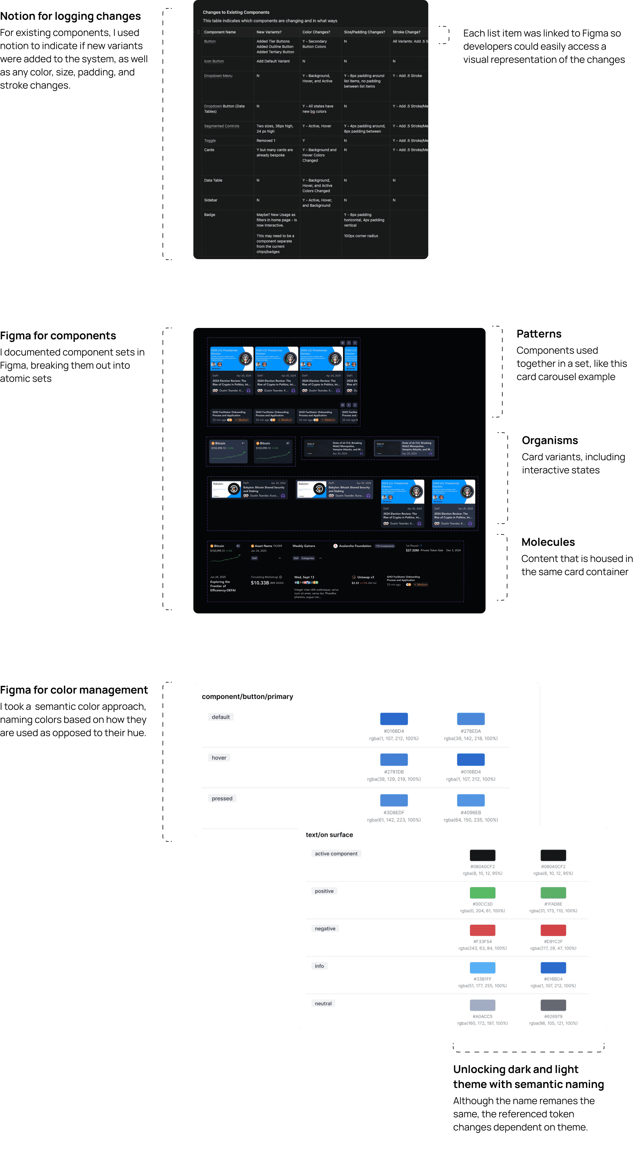
I used both Figma and Notion to document changes - notion outlined exact changes to existing components, while Figma housed design tokens and components
I used both Figma and Notion to document changes - notion outlined exact changes to existing components, while Figma housed design tokens and components
My Approach
My Approach
Improving existing components and adding new ones
Improving existing components and adding new ones
Feedback showed Messari users are highly data-driven, so we boosted hierarchy and contrast to show more info clearly, including a refresh to light theme.
Feedback showed Messari users are highly data-driven, so we boosted hierarchy and contrast to show more info clearly, including a refresh to light theme.
01
01
Increase contrast
Increase contrast
How can we make information hierarchy clear on packed screens?
How can we make information hierarchy clear on packed screens?
02
02
Clarify common patterns
Clarify common patterns
Menus, filters, and controls needed to be standardized across surfaces
Menus, filters, and controls needed to be standardized across surfaces
03
03
Refine colors
Refine colors
Defining corresponding theme tokens made transferring design into light theme a breeze
Defining corresponding theme tokens made transferring design into light theme a breeze
01
Increase Contrast

Before
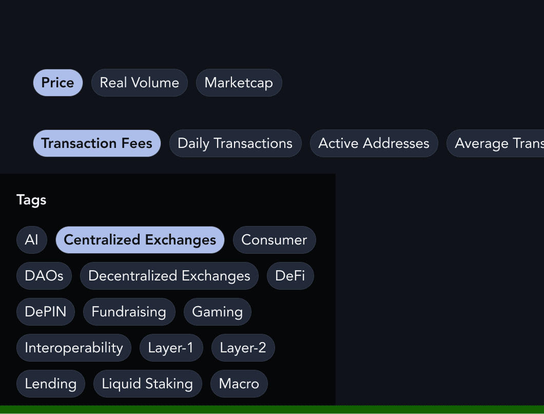
Most selectors (like filter chips and content controls) blended into the background and lacked clear visual distinction in their default state.
Most selectors (like filter chips and content controls) blended into the background and lacked clear visual distinction in their default state.
After
I consolidated chip styles, increasing both contrast and compactness.
I consolidated chip styles, increasing both contrast and compactness.
02
Clarify Common Patterns

Before
Long multi-select menus (used across the product) made it unclear what was selected or if changes were applied.
Long multi-select menus (used across the product) made it unclear what was selected or if changes were applied.

After
I improved a menu by including a clear area where selections were visible, as well as an “apply” button.
I improved a menu by including a clear area where selections were visible, as well as an “apply” button.
03
Refine Colors
I set up light and dark theme variables, so designers can now switch themes in seconds. instead of spending hours manually updating everything.
I set up light and dark theme variables, so designers can now switch themes in seconds. instead of spending hours manually updating everything.
The Outcome
The Outcome
Improved design and developer efficiency, optimizing workflows and enabling faster delivery 🚀
Improved design and developer efficiency, optimizing workflows and enabling faster delivery 🚀
I collaborated with developers to ensure alignment between Figma and Storybook, focusing on component types, interactions, theming, and best practice naming conventions.
I collaborated with developers to ensure alignment between Figma and Storybook, focusing on component types, interactions, theming, and best practice naming conventions.
️ 🔮 What’s next?
The system is continually evolving. Adding additional documentation and recommendations for usage will further increase its utility.