Overview
Overview
Custom dashboard boosting CTR by 9.7%
A new user lands on the Messari homepage, eager to get plugged in on the latest in crypto. But instead of clarity, they find a static layout and leave within minutes. Analytics showed low engagement from first-time visitors, and user interviews echoed the problem: most people had no idea how much data Messari actually offered.
I led the design of a new homepage experience with a simple goal to help users discover value faster, and keep exploring.
A new user lands on the Messari homepage, eager to get plugged in on the latest in crypto. But instead of clarity, they find a static layout and leave within minutes.
Analytics showed low engagement from first-time visitors, and user interviews echoed the problem: most people had no idea how much data Messari actually offered.
I led the design of a new homepage experience with a simple goal to help users discover value faster, and keep exploring.
Problem
Problem
Users arriving on the Messari homepage often failed to grasp the platform's full value, leading to low engagement and poor conversion to paid subscriptions.
Users arriving on the Messari homepage often failed to grasp the platform's full value, leading to low engagement and poor conversion to paid subscriptions.
Outcome
Outcome
👩💻
New desktop and mobile homepage with a 9.7% CTR lift
👩💻 A responsive homepage experience, resulting in a 40% increase in CTR
💰
Improved Lite tier conversions by surfacing value faster
💰 Improved Lite tier conversions by surfacing value faster
🤖
Scalable, widget-based layout built for future data expansion
🤖 Scalable, widget-based layout built for future data expansion
Role
Role
Lead Product Designer
Lead Product Designer
Team
Team
Lead Product Designer (me), PM, Engineering
Lead Product Designer (me), PM, Engineering
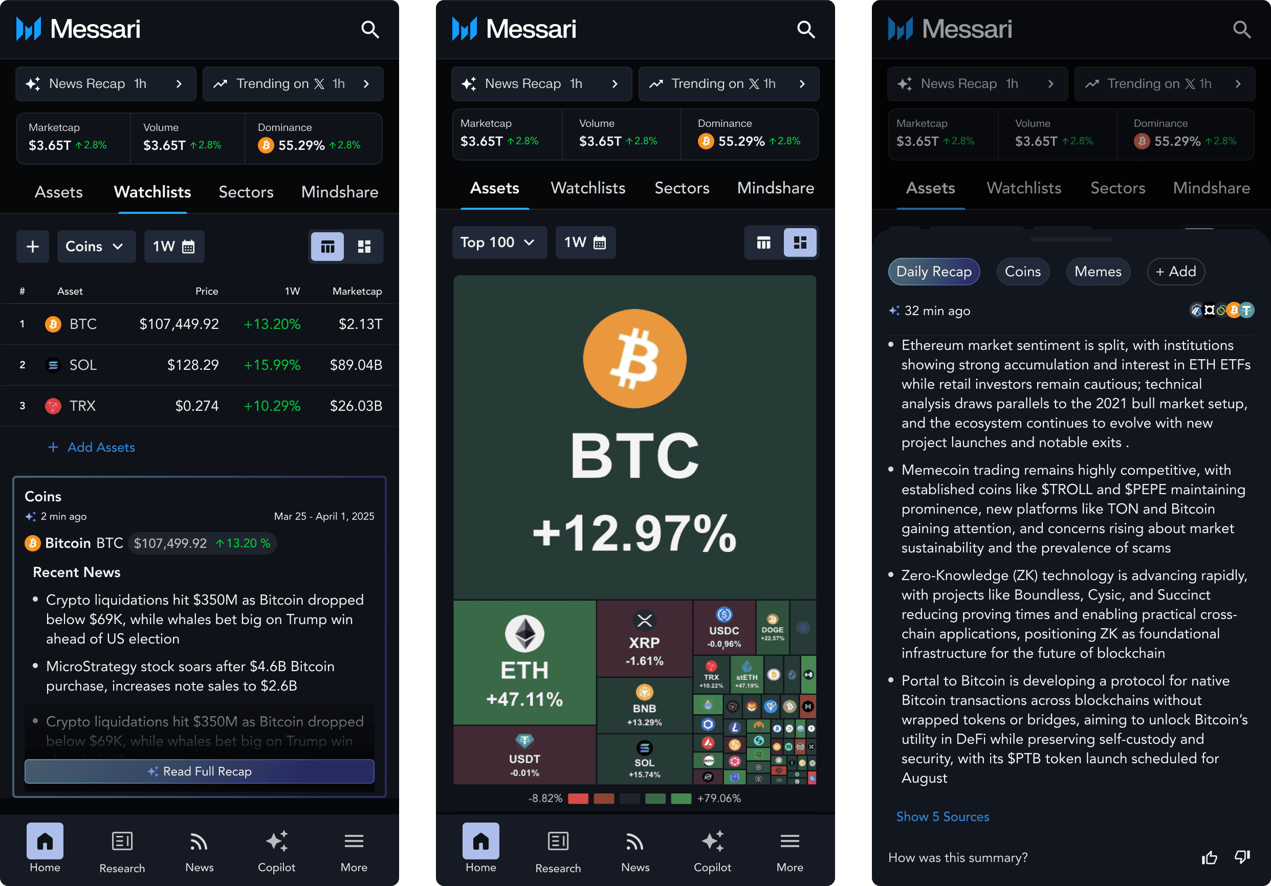
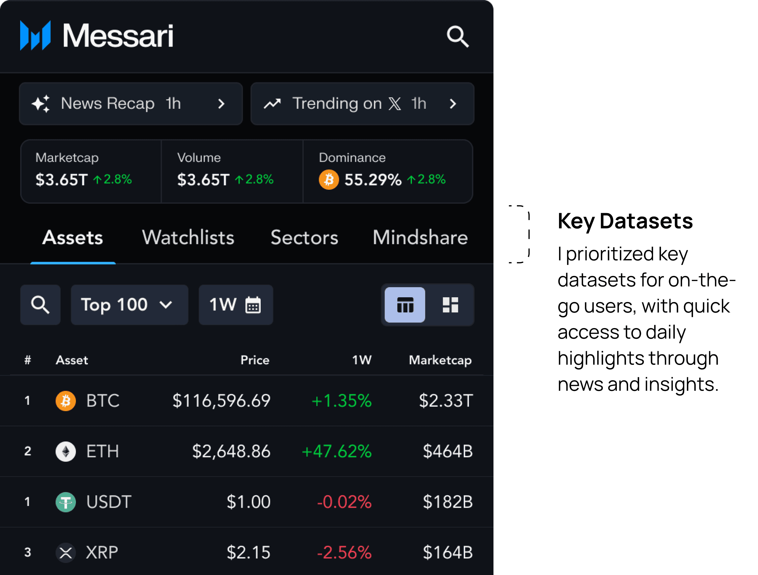
I used tabs on mobile to surface key datasets and give users quick, on-the-go insights, making the platform’s value clear
I used tabs on mobile to surface key datasets and give users quick, on-the-go insights, making the platform’s value clear
My Approach
Alignment workshops, usability testing, and iteration were core to landing a final design.
Alignment workshops, usability testing, and iteration were core to landing a final design.
01
01
Alignment with stakeholders
I kicked things off with low-fidelity wireframes to align quickly with stakeholders on layout, data density, and access by tier.
I kicked things off with low-fidelity wireframes to align quickly with stakeholders on layout, data density, and access by tier.
02
02
Usability Testing
Usability Testing
Once we had a direction, I tested early concepts with users to uncover pain points and better understand their needs.
Once we had a direction, I tested early concepts with users to uncover pain points and better understand their needs.
03
03
Iteration and Systemitizing
Iteration and Systemitizing
The design evolved into a flexible system with swappable widgets, sector filters, and a scalable structure ready for future data.
The design evolved into a flexible system with swappable widgets, sector filters, and a scalable structure ready for future data.
Early designs helped to vision set with stakeholders:
Early designs helped to vision set with stakeholders:

I used testing and interviews to validate designs, solve usability issues, and deliver a polished, high-impact experience.
Usability testing validated key design choices and surfaced areas for improvement.
Through a mix of user interviews and prototype testing, I refined details, solved usability challenges, and delivered a polished, high-impact experience.
Before
Filter chips doubled as headers, which made it tough for users to tell widgets apart at a glance.
Filter chips doubled as headers, which made it tough for users to tell widgets apart at a glance.
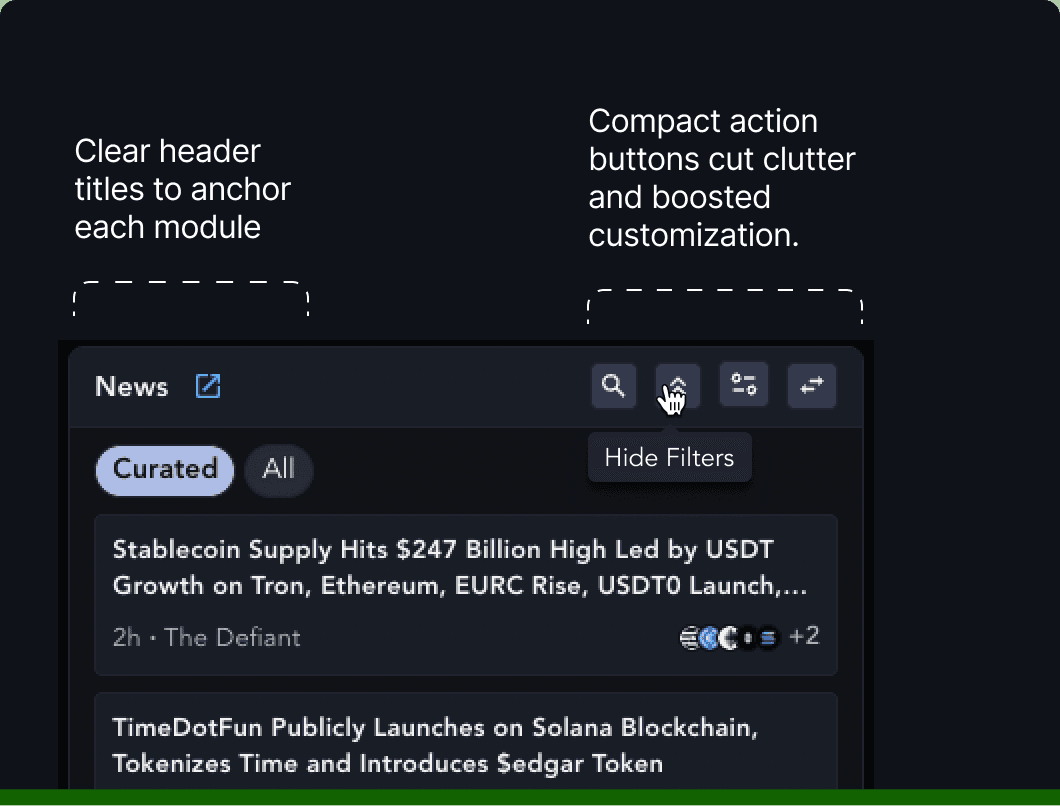
After
Clear headers improved widget clarity, and a toggle to hide filter chips gave users a compact view they wanted.
Clear headers improved widget clarity, and a toggle to hide filter chips gave users a compact view they wanted.
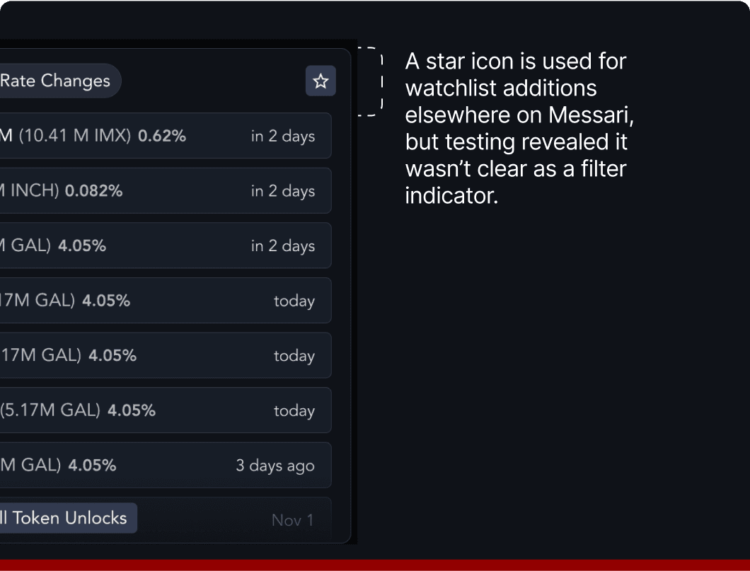
Before
Users wanted to customize their dashboard by asset groups, but 8 out of 10 testers had trouble filtering widgets by their watchlist.
Users wanted to customize their dashboard by asset groups, but 8 out of 10 testers had trouble filtering widgets by their watchlist.

After
Users found the filter icon easy to use for filtering watchlists. They also expressed interest in filtering by sector to analyze trends within specific market segments.
Users found the filter icon easy to use for filtering watchlists. They also expressed interest in filtering by sector to analyze trends within specific market segments.

Before
Users tried resizing and reordering widgets to prioritize key data, revealing that the current layout editor was too limited and needed more flexibility.
Users tried resizing and reordering widgets to prioritize key data, revealing that the current layout editor was too limited and needed more flexibility.

After
I introduced a “swap widget” view for quick switching and added a column to fit two extra widgets at larger monitors
I introduced a “swap widget” view for quick switching and added a column to fit two extra widgets at larger monitors
The Solution
The Solution
A configurable, widget-based dashboard that supports a large-scale charting module. Optimized for responsiveness.
A configurable, widget-based dashboard that supports a large-scale charting module. Optimized for responsiveness.
I designed a modular home page featuring 14+ customizable widgets, allowing users to prioritize the data that matters most to them. Built for scalability, I crafted these widgets to seamlessly adapt to future data sets.
I designed a modular home page featuring 14+ customizable widgets, allowing users to prioritize the data that matters most to them. Built for scalability, I crafted these widgets to seamlessly adapt to future data sets.
⭐️ Fun Fact
This project leveraged components from our new design system in both dark and light themes—an initiative I led, which you can read about here.
This project leveraged components from our new design system in both dark and light themes—an initiative I led, which you can read about here.

I partnered with developers to optimize performance across devices, scaling modules to screen size and creating a mobile view for quick, on-the-go insights.
I partnered with developers to optimize performance across devices, scaling modules to screen size and creating a mobile view for quick, on-the-go insights.
The Outcome
The Outcome
Positive reception by power users and new users alike
Positive reception by power users and new users alike
Since launching in April 2025, the new homepage has boosted engagement with key datasets. We've since added social data, sector benchmarks, and better filters—and premium datasets are expected to drive even more value for Pro and Enterprise users.
Next up: a revamped AI Digest, AI-powered insights in tables, and support for multiple dashboard views.
9.7%
increase in CTR